UI Design
Kiehl's
Evaluating the Kiehl's website to better integrate the brand ethos into the UI design.
Time: 2020 / 2 months
Tools: Figma, Adobe Photoshop & Illustrator
01
Brand strengths not effectively communicated.
Emphasize brand's commitment to natural products by highlighting natural ingredients.
02
Design lacks warmth and personality.
Create a personal design through a revised color palette and the addition of hand drawn elements.
03
Ineffective search and filter functionality.
Implement more user friendly search and filter menus through increased function and visibility.
Process
Discover
Research
Competitor Analysis
Define
Solution
Task Flow
Wireframe
Design
Mood Board
Prototype
Design System
01

About

Kiehl's is a skincare brand that promotes healthy skin through the use of products that focus on natural ingredients. Kiehl's opened its first flagship in 1851. It has grown into a vastly popular go-to for customers looking for quality, natural, and simple skincare products.
02

Research

Kiehl's has pharmacy roots and a long commitment to honest ingredients. Within the overall beauty market, customers are more focused these days on product ingredients and brand inclusivity.

"Kiehl's was one of the first companies to list their ingredients on their packaging in 1924. They have long been dedicated to teaching their customers and having an open dialogue about wellness." (kiehls.com)

"...beauty felt exclusive rather than inclusive.... big beauty companies were not addressing their specific needs, their skin tones, their color choices…" (Harvard Business School)

"...services and products that cater to their specific needs better." (Total Retail)
03

Competitor Analysis

Strong competitors embodied clarity and easy site navigation. They delighted customers with highlighted ingredients and charming how-to graphics. Though many competitors lacked space within the design creating cluttered content.
#000000
#F1F1F1
#E6D4E2
#E68249
Ulta Beauty
Ulta Beauty is a giant, American retailer for skincare and cosmetics. The site is cluttered and the design feels dated. On the other hand, there is a lot of well laid out product information. Ulta beauty's brand is fresh, feminine, and traditional.
#000000
#F3F3F3
#6E6E3A
#CFCC79
Origins
Origins is a popular retailer for natural cosmetics. The website is clear with beautiful images, smart filters, detailed product information, and key ingredients. Further, each product’s use is clearly explained through charming graphics. Origin's brand is calm, organic, and minimalist.
#666666
#E6E754
#F09791
#F09BF3
Drunk Elephant
Drunk Elephant is a hip retailer for skincare products. Upon intial review, the webite fun, bold, easy, to navigate. Further, the product page is packed with well laid out information of consumer reports and product companion suggestions. Drunk Elephant is bold, fun, and modern.
04

Solution

Better integrate the brand identity into the design to create a more inviting and modern website.
05

Task Flow

Using the most common task of browsing, searching, and choosing a product allowed for a rounded design edit of the site. Through these tasks, I worked to improve the vibe, brand design identity, and filter functionality.
06

Wireframe

The wireframe objectives were to create a more functional, visible filter system and to better highlight products. Once on the product page, have designs the highlight the product and it's natural ingredients.
07

Mood Board

The color palette was sourced from different existing Kiehl's products. It plays upon the modern fresh feeling of the product labels created by muted tones with energized accents.
13

Prototype

Landing Page
Hand drawn illustrations add a soft feel and modern vibe. Floral watermarks push the brands natural narrative and highlight the products. The combination of humanistic type, bold images, and oversized illustrations invite the user in.
Search & Filter
First, filters were redesigned to be bolder and clearer for better usability. I took reference from old pharmacy labels to tie the visuals of filters back into the roots of the brand. Second, search functionality upgraded to include smart suggestions. Finally, the category pages were redesigned to feel calm, light, and airy to decrease shopping fatigue.
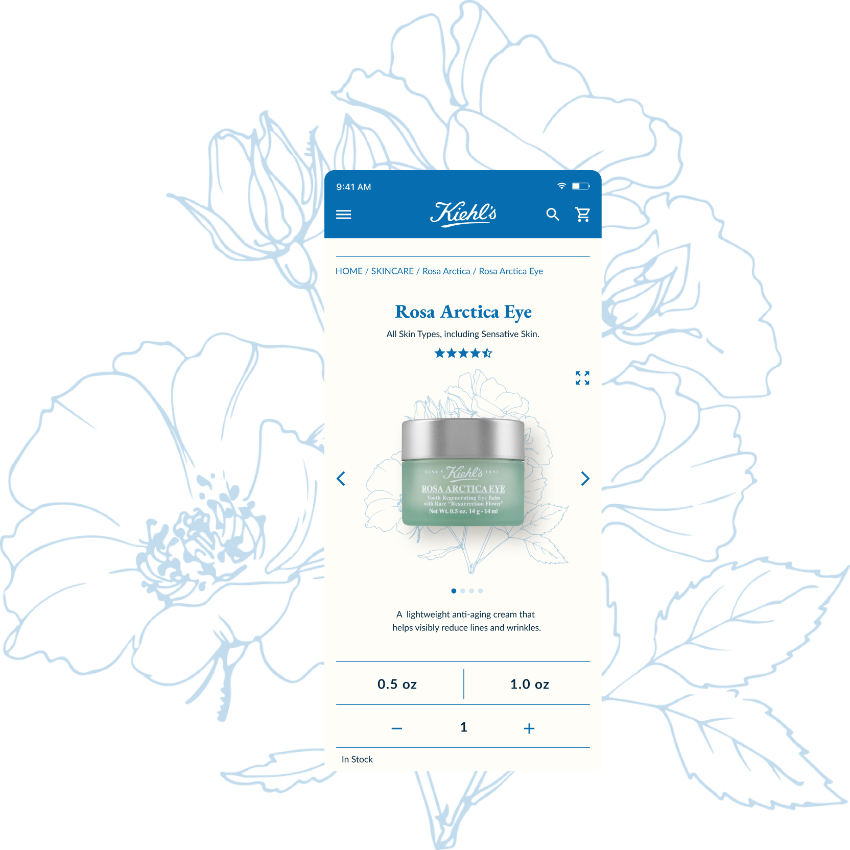
Product Page
Ingredients highlighted and modernized through illustration.
14

Design System

The color palette was derived from existing Kiehl's product labels. The blue and cream create a heritage feel while the small pops of color are modern, bright, and playful. The font EB Garamond was chosen to provide a humanistic and inviting quality to the design. The secondary font, Lato, adds a modern edge and serves as a clear font for body text and information. The rounded icon system and buttons bring a friendly and casual vibe to the design.The color palette was derived from existing Kiehl's product labels. The blue and cream create a heritage feel while the small pops of color are modern, bright, and playful. The font EB Garamond was chosen to provide a humanistic and inviting quality to the design. The secondary font, Lato, adds a modern edge and serves as a clear font for body text and information. The rounded icon system and buttons bring a friendly and casual vibe to the design.
Illustrated flowers help convey the brand's mission to use natural ingredients. The hand drawn style creates a warm feel and nods to Kiehl's long heritage since 1851.
15

Final Thoughts

With more time on this project, I would like to explore two things further: animation and product application. Exploring the illustrations being animated into life would be a great addition. Creating a real-life version of the illustrations when a user hovered over them. Further, adding in a feature that works on product directions in more detail. Illustrating step by step directions for each product within the product page. This project was a great challenge in terms of illustration and challenging myself to keep something light and unique when presented with lots of product information that needs to be displayed.
Next