UX / UI Design
halz
Creating a digital shopping experience for a brand that embodies inclusivity and flexibility.  
Time: 2020 / 2 months
Tools: Figma, Miro, Adobe Illustrator
01
Effectively communicate size-less philosophy.
Create clear size guidance through descriptions, flat diagrams, and measurements.
02
Design lacks youthful engagement beyond products.
Create a sense of wonderment, exploration, and community for users.
03
Sparse knowledge of brands shipping, ethical, and sustainability practices.
Implement more accessible information through friendly icons, concise messages, and automated updates.
Process
Discover
Research
Competitor Analysis
Empathy Interviews
Affinity Map
Persona
Insight Statement
Journey Map
JTBD
HMW
MVP
Define
Site Map
Task Flows
Wireframe
User Testing
Design
Prototype
Design System
01

About

"Halz is a collaborative response to the fashion industry; we strive to negate gender and minimize sizing. Halz aims to create a safe, transparent space where clothes are for people. We make neither menswear, nor womenswear, nor clothing only for the queer community; we make clothes for people."

I developed a design that allows the user to better flow through tasks, fosters community, and inspires the Halz audience.
02

Research

There is an increasing demand for inclusivity and size diversity in fashion. Customers want brands that honor their values and create a community space.
Quotes:
"But sticking to the values and the image that you set for yourself and the brand is also important. I would say even more important than the clothes itself." (Business Insider)

"The Phluid Project was a place where young people could gather and conversations would happen..." (Vogue Business)
03

Competitor Analysis

Friendly, casual language and graphics are an important guide for conveying a brand's mission. Positive features were fullscreen images and clear navigation. A common drawback was a lack of size information.
04

Target Segmentation

Younger generations are craving sustainability and inclusivity. People want to feel cool through their purchases.
01
Millennials and Gen Z’s in US metropolitan areas who feel burdened by the existential threat of climate change desire transparency of practices from companies they shop with.
02
White-collar adults with financial means and a desire to dress cool need guidance in getting the right fit and style.
05

Empathy Interviews

Shoppers are craving transparency and sustainability from their products. Further, there is an increased demand for more inclusivity.
Quotes
"Transparency of practices."

"Clothes that make people feel good about themselves at any size."

"Brands that are conscious of making the best choices for the world at large and not just their company."
06

Affinity Map

Key findings through affinity mapping were that customers are often confused about sizing and often don't feel that their body type is represented. More shoppers are excited about genderless clothing. Ethics and sustainability are becoming higher priorities for customers.
Fair Labor

Sustainability

Inclusivity

Genderless

Sizeless

Clothing Fit

Company
Vibes
Marketed Values

Design Elements

Lack of
Representation
Goods
Timeline
Privacy

07

Persona

Through persona development and empathy mapping two distinct users surfaced. A younger shopper who values ethics, but feels that brands often advertise ethical practices as a trend then with real action. Another shopper who wants to feel cool, but often finds that fashion brands are boring or do not care about her demographic.
Sarah, 56
"I don't feel represented in fashion. I never see models my size or age. I wanna support better brands but need it to be easy."

Professor
Chicago, IL
Needs
Thorough size details, clear brand values
Goals
Feel cool in her clothes, better understand fit/one size fits all, support better brands
Pains
Has a hard time finding cool brands with diverse models and understanding fit
Gains
Feel excited with clothes and that brands care about her as a customer
Lauren, 28
"As a gay person who shops both genders, I want to feel represented in my identity while supporting brands with good ethics."

Law Student
Brooklyn, NY
Needs
Brand transparency, model diversity
Goals
Support brands with shared values, easy site navigation
Pains
Not feeling her identity is represented, feeling like brands are disingenuous, a hard time navigating sizing
Gains
Brand transparency, easy navigation of size and identity
08

Insight Statement

Lauren desires to purchase ethical products while navigating distrust of companies. While Sarah has a hard time finding brands that are cool and catering to her demographic.
LAUREN
Lauren likes to shop with brands that have a mission because her passion for the world and others is very important to her identity. However, she often feels that brands are disingenuous in their missions.
SARAH
Sarah loves to wear a cool outfit when out socializing with friends. When shopping, she often finds it hard to find brands that cater to her leaving her frustrated and empty-handed.
09

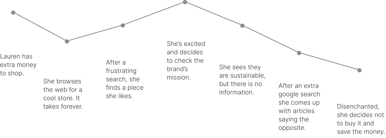
Journey Map

User
Lauren
Scenario
Lauren wants to shop, but has trouble finding cool brands. Once she finds a product she likes, she is disappointed to learn that they are not sustainable. Frustrated, she buys nothing.
10

JTBD

Lauren wants to buy into good practices. Sarah wants clothes that fit her well and make her feel cool.
LAUREN
Lauren wants to support brands with good values, but struggles to easily obtain that information leaving her confused about where to spend her money.
SARAH
Sarah loves to wear a cool outfit when out socializing with friends. When shopping, she often finds it hard to find brands that cater to her leaving her frustrated and empty-handed.
11

HMW

The first objective was to make the brand's mission concise and casual for user while building trust. The second objective was to create easier and more inclusive sizing while maintaining user interest.
LAUREN
How might we make buying ethical / sustainable products a stress-free, fun experience?
  • Make customers feel involved in the process
  • Recycled packaging option
SARAH
How might we make people feel represented in their size and their desire to be cool?
  • Clear diagram of garment measurements
  • Show other customers in clothes
12

MVP

Through the MVP strategy, I was able to distinguish what was necessary and which delighters could be the most powerful additions.
LAUREN
Table Stakes
  • Complete and accurate product information
  • Clear mission statement
  • Genuine facts
  • Sustainability product information
  • Ethical product information
Delighters
  • Fun features explaining mission
  • Links to sustainability articles
  • Eco-friendly process explained
  • Different zero waste options
  • Open communication with the customer
SARAH
Table Stakes
  • Size chart / information
  • Brand size guidance
  • Clear sizeless explanation
  • Stylized campaigns / product photos
  • Edgy brand vibes
Delighters
  • Creative process shown
  • Collaborations / campaigns
  • Custom sizing
  • Fun size guiding graphics
  • Photos of customers in clothes
13

Site Map

Site map objectives were to add more community pages to explore as well as more sustainability and size guidance.
14

Task Flow

Identifying the most common e commerce tasks and how to best represent new user insights.
TASK 01 / THOUGHTFUL SHOPPER
The user completes the task of arriving at the website, browsing, and selecting a product. Here they are greeted with icons that define the different ethical and sustainable components of the product.
Menu / Shop
Browse Product
Select Product
Material Details
TASK 02 / SIZE INFORMATION
The user is guided through the brand's sizeless mission when looking at the product details and selecting a size.
Product
Size Details
Select a Size
Add to Cart
TASK 03 / CHECKOUT
The user is guided through checkout with clarity on lead times and sustainable shipping options.
Cart Summary
Checkout
Review
Order Confirmation
TASK 04 / CURIOUS BROWSER
Here the user navigates between the menu and different pages to explore and get inspired by such as; collections, collaborations, and about us.
Menu / Collaborations
Browse
Bea x Halz
Menu / About Us
15

Wireframe

I started with pen and paper to work through my initial task flow of selecting a size and ensure that all the crucial elements were present. Then I moved onto Figma to create a prototype for testing.
HOVER OVER SILHOUETTES
Illustrations animate on product hover
on category pages.
GUIDING ICONS
Convey product details about sustainability and ethics through digestible icons.
SIZE HELP
Use of graphics with specific measurements to help guide users.
EXPLORE
Add in pages for users to explore such as brand collaborations with artists.
16

User Testing

A main insight was that brand mission lacked clarity and presence as users entered the site. Further, there was a lack of product information creating lower conversion rates.
FULLSCREEN VISUALS
Users were confused by the large opening imagery. There was a lack of context about the brand and ease of shopping immediately.
SIZE HELP
Users enjoyed garment graphics with specific measurement details.
PRODUCT DETAIL
Users desired more information on the product page such as shipping & returns details.
TIMELINE
Users desired more disclosure and reminders about the 4-6 week lead time.
17

Prototype

Landing Page
Landing page opens with inspiring imagery and simple, easy navigation.
Category & Product Pages
Illustrations are woven throughout to help the customer better understand the product and it's sustainable components.
Product Details Page
Graphics provide detailed information about size and fit. Adjustability is also highlighted through clear graphics. This helps guide the customer in how sizing works and the different ways the item can be worn.
Checkout
Clear and simple checkout process.
Explore
Creating a world for customers to explore and engage with the brand outside of shopping. Halz is rooted in community and sustainability and needed a flow that helped share that ethos.
18

Design System

#000000
#333333
#8E8E8E
#F5F5F5
#FFFFFF
To stay consistent with the brands logo, the color palette was kept minimal. Halz is about classic, timeless pieces and using white, grey, and black helped convey that feeling. A neutral palette further helped keep the focus on imagery.
Aa
DIN Condensed is a bold, sans serif typeface that best matched the Halz logo type.
A B C D E F G H I J K L M N O Ö P Q R S T U V W X Y Z a b c d e f g h i j k l m n o p q r s t u v w x y å ä æ ñ ö ø é
Aa
Inter is a simple, minimalist typeface that suits web and mobile.
A B C D E F G H I J K L M N O Ö P Q R S T U V W X Y Z a b c d e f g h i j k l m n o p q r s t u v w x y å ä æ ñ ö ø é
15

Final Thoughts

The outcome of this project was a design that followed function. After user testing, I was able to focus on the best way to make sure the mission of Halz NYC was clear; genderless, sizeless clothing with a sustainable emphasis. Giving the user easy ways to uncover the Halz ethos allowed for a smoother shopping experience. In the future, I would love to explore animation further with all the illustrations. Animating graphics would further get across a captivating, edgy, and cool vibe that the Halz audience is craving.
Next