01
Captivate and guide new customers.
Create a homepage that highlights beautiful product imagery, tells the brand story, and guides customers into categories and special outfitting shops.
02
Welcome and entice new customers.
Entice customers to sign-up for email and SMS then draw them into the brand story and encourage them to try the product with a promotion.
03
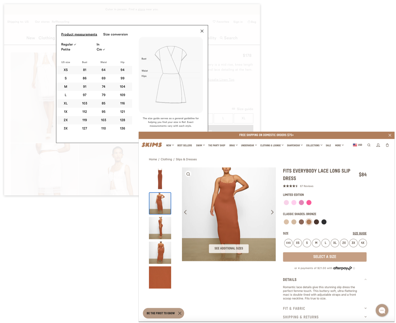
Ensure strong buying confidence.
As many are first time customers, ensure their buying confidence with an informative size guide. Further, clearly advertise free shipping & returns.
04
Inform customers of sustainable practices.
Teach customers about the different fabrications that make the products not only luxe, but also sustainable. Create a relaxed shopping experience that conveys the brand's sustainable mission.